

Most underperforming websites were not born underperformers. They launched clean and capable, then slipped behind while everyone moved on to the next priority. The links worked on Day One. The copy was built to cater to the brand’s audience from the start. Day One was a while ago.
That’s the real divide between a high-performing site and a struggling one. It’s rarely about which one is prettier or newer. It comes down to which one gets regular attention and updates. High performers get tended. Underperformers get launched and forgotten.
The encouraging part is that most of what separates successful sites from underperformers is more fixable than you would think. Here’s what to look at.
Your Site Is Judged Within 50 Milliseconds
Researchers at Carleton University found that people form a first impression of a web page in roughly 50 milliseconds. That’s less time than it takes to blink. Stanford’s long-running Web Credibility research points the same way. Almost half of the people studied said the look of a site shapes whether they trust the business behind it.
It’s tempting to read that as proof you need a flashier website. You don’t. Initial judgement about your business is not based on how impressive your site looks. Rather, it’s based on whether your message is clear and your business looks credible.
A high-performing site answers two questions fast: what is this, and is it for me? Then it makes the next step obvious. An underperforming site makes people hunt for the answers, or guess. When a potential customer lands on your homepage and cannot tell what you offer or who you serve, no amount of polish will save it.
Most Slow Sites Are Slow By Choice
Google’s research on mobile pages is blunt: the longer a page takes to load, the faster customers give up on it. Stretch load time from one second to ten and the odds a visitor bounces away more than double. Most guidance puts the danger line around three seconds, and people are not getting more patient.
The frustrating part is that most slow sites are slow by choice. The usual offenders are the things added to look impressive. A giant, rotating hero image that buries your real message below the fold. Heavy custom fonts do the same kind of damage, holding your words hostage until they finish downloading. Each one feels like an upgrade when you approve it, but each one forces a visitor to wait.
There is a newer reason to care about load times in 2026. The AI tools people increasingly use to find businesses tend to skip past pages that are slow or messy to read. A bloated site doesn’t just cost you visitors. It can cost you the chance to be recommended online.
Design Trends Are Seasoning, Not The Meal
Every year brings a fresh batch of web design looks. Figma’s roundup of 2026 trends leans hard on immersive 3D and heavy motion. It also pushes experimental navigation that throws out the familiar menu for something closer to a maze. Some of it is beautiful. None of it is a strategy.
Here is the quiet trap. The same choices that win design awards can lose customers. Experimental navigation looks clever right up until a customer cannot find your phone number. A 3D hero visual is impressive until it adds three seconds to your load time on a phone. A trend earns its place only when it helps someone understand you faster. The moment it gets in the way, it’s working against you.
So borrow the trend if it serves the message. Skip it if it’s only there to impress other designers.
Most Bad Sites Are Neglected
A website is not a building you put up once and forget. It’s closer to a storefront. Leave it alone for a year and the lights start going out. Links break. The services page still lists an offer you stopped running. Photos start to look dated. The work you’re proudest of this quarter sits three clicks deep because nobody moved it up front.
This isn’t just a hunch. Framer’s 2026 State of Sites report, drawn from more than 1,900 people who build and manage company websites, found that most website work is editing and fixing what already exists. Teams put more hours into maintaining a site than improving it. A website is never truly finished. It’s a living thing, and living things need feeding.
So the most useful question is not whether your site was built well. It’s who continually looks after it. For most businesses, steady upkeep is the smart move. A few hours a month spent fixing small things and sharpening the message will quietly outperform a site that gets one heroic overhaul every five years and nothing in between.
A full rebuild is sometimes the right answer, but be honest about why. The State of Sites report also found close to a third of redesigns happen because a brand looks dated. Only about 5% happen because the site itself was underperforming. Rebuilding for looks won’t fix a site that was simply neglected. You’ll land in the same spot a year later.
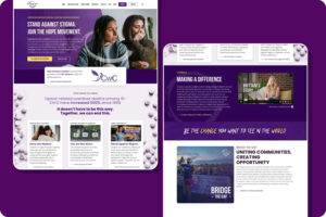
Two reasons justify a full rebuild. The first is age: past about five years, the foundation is usually working against you. The second is story: if the site no longer reflects who the brand is, patching it won’t get you there. That was the spot Hope Movement Coalition was in when they came to us. Their message was powerful but their site was not keeping up, so we built a new one from the ground up around the people it needed to reach. We designed every page to be clear and to make it easy for visitors to find what they need.
Where Should You Start?
You don’t need to pass a verdict on your whole website today. You need one honest look. Open your homepage on your phone the way a customer would. Time the load. Then see whether you can tell, in a few seconds, what your business or organization offers and how visitors can take the next step. That single exercise will tell you more than most paid audits.
If what you find worries you, treat it as useful information rather than a failure. Some sites need a tune-up. A few need a fresh start. If you’d like a second set of eyes, take a look at how we approach web design, or just reach out and we’ll tell you straight up which camp we think you’re in, and what you should do about it.

